The Project
Splitty is a finance app that I created for my UX course at General Assembly. As the sole UX designer, I designed this project from inception to final design through research, ideation and UX design principles.
Challenge: People are bad at fast math, which can make paying for dining experiences challenging and time consuming, especially when trying to split checks fairly based on your consumption
Task: design an application that can quickly split a check at a restaurant.
Duration: 2 weeks
Methods: Surveys, Interviews, Affinity Mapping, Preference Test, Wireframes, Prototyping
Tools: Adobe XD, Diagrams, Flowmap
Research
Competitor Analysis
To get a better understanding of the competitor landscape, I conducted analyses of direct and indirect competitors to understand the market opportunity and threat and found that some have Split Option features but was lacking everything else or charged a fee for the feature but wasn't optimized enough.
Surveys & Interviews
With the goal of understanding how people interact when its time to split checks, painpoints, desire and restrictions I interview 18 people of various age, ethnicities and eating habits.
My findings could be narrowed down into two categories: users that demanded a precise sorting and people that mainly cared about convenience.
Key Findings & Insights
Food is an important factor in social aggregation, when we are at the table we want to enjoy this experience fully whether it is with friends, relatives or colleagues. Different eating habits affect our ordering choices. For example, someone may order food substitutions, multiple drinks or extra sides or desserts, and asking for those items to be removed from the check might embarrass us or make it considerably more difficult for the group and even the restaurants managing the payments.
Define
Problem statement
Restaurant customers need a way to split checks fairly because they don’t want to incur a portion of the cost of other people’s orders.
Core features
With a better idea of my user and their needs, I identified 4 core features that I wanted to focus on for the product.
Scanner
Automate feature to create a list of item from the bill check
Groups
Record group and friends
Item sorting
Optimized gesture to assign and split items
Payment
In app payment
User Flow
With these core features in mind, I started ideating the basic flow for a user to achieve his goal.
Ideate
Low Fidelity Wireframes
Since simplicity and ease of use are one of the biggest aims of this app, the number of screens were kept to a minimum and I wanted to focus on highlighting the core features. I started with pen and paper wireframes, and created multiple versions of each screen until I found a combination of features and elements that I thought matched the users needs and that would be as intuitive as possible.
I've then created mid-fidelity versions of these wireframes in Adobe XD, created a clickable prototype, and found some users to test them out.
Test
Usability Testing
This phase was the game changer - by conducting usability tests, I was able to refine what users were finding useful, and completely change up what they didn’t react well to. The users were asked to complete a few scenario-based tasks that would test the main features of the app, and were asked how they felt about the app in general. The results of the usability tests were recorded and analysed using a rainbow spreadsheet and an affinity map.
Key Findings
I made notes of the positive and negative feedback, so that I knew what areas to keep expanding and what needed to be reworked.
The main changes have concerned the most intuitive way and with less number of operation to assign and split an item.
Positive
- Users were able to complete tasks
- Users enjoyed the UI
- Navigation proved easy for users to understand.
Negative
- Task could have been complete with less interaction
- Users where confused by too many splitting options
- Users found text and icons to be too small.
Iterate
Design Changes
I made changes based on the user feedback and then reached out for additional feedback from some fellow designers. I created a newer, high-fidelity version of the app that featured more white space, larger icons and clearer text.
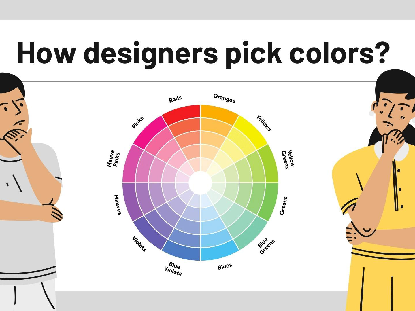
To this design, I applied the Gestalt Principles, colour theory and made use of grids to ensure consistency within the entire app.
the App will automatically pull out the charges taking a photo of the receipt.
From there, a preview of the order will appear
the Groups & Users allows to rapidly create the list of active users at the table
To assign an item drag it over a user, a small feedback of the amount assigned will then appear over the user.
To split an item in-between two or more drag it over a second user and it will be divided in equal parts.
to reset an item assignation drag it backwards
to access item description and advanced splitting option double tap the item.
option available: equal split, percentage split, shares.
Example: Tacos are shared across the table. You eat one, Courtney eats 2, Zia eats 3
from the Review screen its possible to preview tips amount and individual user totals before proceeding with payments. If paid in total it will be possible to request friends share from venmo or zelle.
Evolution
Define UX Metrics
In addition to Adoption and Retention another set of parameters to measure success in this app would be to track the average amount gap in between users in the same table. The bigger the gap means that the social freedom of ordering what the user feels is obtained.
Monetization
Thanks to the core features and the design of the platform we have data regarding the specific dish and the user who order them. This will allow us to create a categorization based on the single dishes and not on the overall restaurant. The user of the platform will have access to suggestions over their favourite orders, popular dishes and offers, specific to their previous orders.
This will create a new shade of food delivery-review platform.
Final Prototype
After the monetisation considerations and many iterations, i introduced the feeds page where the user can have suggestions over his favourite dishes and the popular foods around him. My final product aligns with all of the objectives I had set in place, it includes the core features necessary for users to split the check quickly and easily, while appearing visually appealing and simple to use.
Click below to view the final prototype.
